Fundraising Campaign Websites – Nonprofit Catalog
Once your nonprofit has put in all the effort to plan a fundraising campaign, you should spread the word to generate support. A fundraising campaign website is one of the most effective tools in your marketing strategy for catching supporters’ interest and empowering them to give. Let’s explore the basics of campaign websites!
What Is A Fundraising Campaign Website?
A fundraising campaign website hosts all the information your supporters need to get involved with your nonprofit’s campaigns. This website will help you promote your campaign, spread awareness about your cause, and get your supporters involved, whether they’re donating, volunteering, or sharing your organization’s message.
Campaign web pages can be created on your main website, or you can create a separate microsite for each large campaign. Microsites are separate from the main website, with a different URL, so they allow you to really feature the campaign and its related details. Depending on the size of your organization and its campaigns, as well as what you know about your supporters and how they engage with your cause online, this could be a great option for you.
What Are The Elements of a Campaign Website?
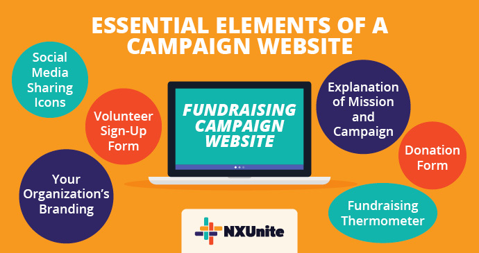
For your website to be an effective tool, it will need to include certain elements that create a positive user experience for your supporters. Here are some essentials to include:

- An Explanation of Your Mission and Campaign: Every fundraising campaign you run should be closely tied to your organization’s larger mission and purpose. Provide a short explanation of what your organization is all about and how your campaign fits into the context of your cause so that supporters know what they’re contributing to.
- Your Organization’s Branding: Whether you designed it deliberately or not, your nonprofit has its own unique brand that includes everything from your logo and color scheme to your guiding values. Incorporating your brand on your website can make this marketing tool more consistent with the rest of your organization’s operations and help you look more professional and legitimate.
- A Donation Form: A well-designed donation form is a crucial part of your fundraising campaign website. After all, this is the tool your supporters will use to act on their passion for your cause and donate to your organization. Keep your form short and simple, with only a few questions that capture essential information (payment details, contact information, etc.). To further optimize your form, offer supporters suggested giving amounts, the option to enroll in your recurring giving program, and the chance to check their matching gift eligibility.
- A Volunteer Sign-Up Form: Similar to a donation form, a volunteer sign-up form empowers supporters to take action in the name of your cause by donating their time and talents. Again, keep the form short but ask for information that will allow you to pair each individual volunteer with a role that suits their age, abilities, and interests as much as possible. If necessary, ensure you include training or waiver information, too.
- A Fundraising Thermometer: Your supporters will want to know how close your organization is to meeting its campaign goals, so make sure to include a fundraising thermometer on your website. Feature your thermometer in a prominent place on the site, and update it regularly to encourage your supporters to keep giving until it fills up!
- Social Media Sharing Icons: Your supporters can serve as ambassadors for your cause and your campaigns by sharing your fundraising campaign website with their personal networks. Make it easy for them to do so by including social media sharing icons in the header or footer of your web pages so they can easily click through to their favorite platforms and share about you!
These elements can all work together to make your campaign website a powerful marketing asset. Depending on the nature of your campaign, you may want to include other features like an event registration form, an advocacy campaign explainer, or an online merchandise store.
4 Fundraising Website Design Best Practices
Including the elements discussed above in your fundraising website will allow you to set up a site that pulls your supporters in. Here are some design best practices to implement to take your site to new heights:
- Hone the user experience by prioritizing smooth navigation, writing digestible content, and including high-quality images across the site.
- Ensure your website is accessible for people of all abilities by following Web Content Accessibility Guidelines (WCAG).
- Optimize your site for mobile so that everything resizes properly and no one has to pinch and zoom to understand your content or use your tools.
- Work with a nonprofit website design agency to take the look and feel of your site to the next level!
A well-designed fundraising campaign website that contains all the right elements and information can help your nonprofit succeed in its next fundraising endeavor. Use these tips to get started building your fundraising website today!
Additional Resources
Nonprofit Catalog – Read up on more nonprofit essentials by exploring our Nonprofit Catalog.
Nonprofit Website Builders: The 11+ Best Providers – To make an amazing campaign website, you’ll need the help of a robust website builder. Here are some recommendations.
SEO for Nonprofits: A Complete Guide [+ Optimization Tips] – Search engine optimization (SEO) can help people find your website and campaign pages. Learn how to tap into the power of SEO by reading this guide!


