Nonprofit Graphic Design – Nonprofit Catalog
Among a sea of charitable causes, your nonprofit needs to do what it can to stand out and attract supporters. That all starts with creating eye-catching marketing materials that feature powerful nonprofit graphic designs.
From your nonprofit’s website to your direct mail outreach, graphics are entwined with your nonprofit’s overall image. Everything from your colors to your typography is associated with your cause. Let’s review the basics of effective graphic design for nonprofits, so you can capture your brand and pique supporters’ interest.
What Is Nonprofit Graphic Design?
Nonprofit graphic design refers to the visual aspects of your nonprofit’s brand. It’s a craft that involves creating visual content to communicate messages and tell your organization’s story. Graphic design includes the typography, colors, images, and any other artistic components used in your printed and digital materials.
Visuals that require design work range from your logo to the images you use across your website, and they communicate to supporters what your organization is all about.
By applying layout and visual hierarchy techniques, your nonprofit can create artwork that helps communicate your message, spruce up your marketing materials to be more digestible, and strengthen your brand identity.
Types of Graphic Design for Nonprofits
Regardless of the cause you’re furthering, creating a strong brand identity is vital to your success. Your graphics are a major contributing factor to your nonprofit’s identity and can be broken down into a few main types.
Note that each type of nonprofit graphic design requires varying levels of design expertise, which may mean you should outsource some of the heavy lifting to a professional if you don’t have a dedicated designer on staff.
Now, let’s dive into the five main categories of designs your materials will fall under.
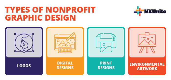
Nonprofit Logos
Your nonprofit logo is one of your most important brand assets. From your website to your fundraising letters, your logo appears across all of your brand creatives, meaning it will be one of the first things that comes to mind when someone thinks of your nonprofit.
Kwala’s guide to nonprofit logos breaks down a few core design elements that contribute to any logo:
- Your mission. Nonprofits should choose symbols, images, and words that are closely associated with their cause.
- Colors. Different colors evoke different emotions and symbolize different things. For instance, green is commonly associated with the Earth and is primarily used by environmental organizations. Red can communicate urgency, love, or violence, which is why disaster relief, health, and anti-violence organizations use it in their nonprofit graphic designs.
- Typography. Fonts also elicit different emotions. If you’re shooting for a traditional font, go with a serif font, but if you’re looking going for a modern and minimalistic design, go with a sans-serif font. To mimic real handwriting and calligraphy, use a script font, which can either look elegant or playful depending on the exact one you choose.
- Simplicity. The most memorable nonprofit logos are simple and not overloaded with too many elements. A simple design will incorporate white space effectively and feature only the most important colors, symbols, and words related to the organization’s mission.
Take the World Wildlife Fund’s logo for example. This unique logo features a minimalistic design, a symbol of the endangered giant panda, and the organization’s acronym.
By ensuring all of these elements shine through in a logo, any nonprofit can create a memorable graphic design that perfectly encapsulates its cause.
Digital Graphic Designs
In a digital-first world, visually-compelling content is more important on social media, email, and other digital platforms than ever before.
Here are some common types of graphics that will come into play when creating digital marketing materials:
- Your website: Effective graphic design for nonprofit websites can optimize the user experience and guide readers through your content. Choose banners and supplementary images that demonstrate your values and feature your beneficiaries and volunteers. Feature graphics like your logo, carefully choose your color scheme to match your brand, and use colors and headings strategically to highlight important content and establish a visual hierarchy.
- Email newsletter: Newsletters heavily rely on striking the perfect balance between content and graphics. Avoid walls of text by using images, headers, and graphics to break up the text and make your organization’s newsletter easy to digest.
- Videos: Great for featuring on social media and embedding into your website, videos enable supporters to hear directly from your nonprofit’s leadership, staff, volunteers, and beneficiaries. This is a fantastic way to humanize your nonprofit’s work, but creating videos requires some level of experience with video, audio, and graphic editing.
- Infographics: These types of nonprofit graphics break down complex information and put it in a digestible format. Most commonly, they feature statistics related to the cause that help supporters visualize your impact.
These are just a few common nonprofit graphic designs you’ll use across your digital outreach. Whether you’re launching a fundraiser or sharing updates on a project, your artwork can play a part in connecting with supporters in the competitive online space.
Print Designs
The internet might dominate today’s world, but print marketing is still awfully important for pushing your cause forward.
A few common print materials that incorporate nonprofit graphic design include:
- Brochures: Give rundowns of your programs, services, and major fundraising campaigns through colorful brochures with compelling images, readable fonts, and well-organized copy.
- Letters and postcards: Instead of sticking to plain black ink on white paper, get creative with your solicitation letters and postcards. Spruce them up by including your logo in your letterhead and on the envelope, artistic graphics representing your mission, colors emphasizing key information, and a perforated return envelope that’s pre-addressed.
- Merchandise: From t-shirts to mugs, nonprofit graphic design elements are infused into your branded merchandise. Make sure merchandise captures your organization’s identity with elements like your name, logo, colors, and graphics that communicate your mission.
- Annual reports: Transform a dry summary of your nonprofit’s year into an eye-catching masterpiece. Use charts, photos, and striking colors to show donors what their support helped you accomplish this year.
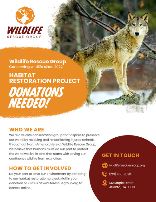
- Fundraising flyers: Filled with colorful typography, varying font sizes, and eye-catching images, a powerfully-designed flyer like the one below can inspire someone to attend your event or donate to your fundraising campaign.
Our nonprofit marketing guide explains that well-designed print materials can help you connect with supporters who aren’t active online. Plus, it comes across as more personal since it takes a bit more effort than publishing a social media post.
Think of it this way: a well-designed fundraising letter among stacks of bills and junk mail is much more likely to mean something to recipients.
Environmental Designs
Nonprofit graphic design even plays into creating a unique and inviting environment at your organization’s office and events. Combine interior design and graphic design best practices to create an immersive environment that captures your brand with elements like:
- Donor walls: Show appreciation to your sponsors, major donors, and partners by featuring a donor wall. Be creative with your design by moving past generic metal plaques, though. You’ll need to choose a layout that complements the architecture of your space. The donor wall should also be branded with typography, colors, shapes, and other images that communicate your mission. Enhance your office and help donors visualize their impact all at once.
- Banners: Lightweight banners are easily transportable, so you can reuse them at your office, fundraising events, and industry events. Your banner should be simple, featuring only your logo, tagline, and basic imagery.
- Murals: Whether at your office or somewhere around town, a well-painted mural will raise awareness for your organization’s cause while also beautifying the community. Beyond the artwork itself, be sure to include your logo and contact information like your nonprofit’s URL or social media handle.
Spruce up your office, events, and community with these types of designs. No matter what environmental designs you create for your nonprofit, make sure to focus on tasteful artwork that blends into your environment.
Additional Resources
Nonprofit Catalog – Read up on more nonprofit essentials by exploring our Nonprofit Catalog.
The Ultimate Nonprofit Board Report Template and Tips – Need some help formatting your board reports? Check out this guide that gives a rundown of effective nonprofit graphic design for board reports.
12 Best Nonprofit Graphic Design Tools to Amplify Your Cause – Build your arsenal of nonprofit graphic design tools with this ultimate list. You’ll find some great resources to launch your design efforts forward!


