18 Best Nonprofit Graphic Design Examples
With the rise of the digital age, people are consuming information faster than ever. In order to capture their attention before they click away or scroll to the next post, you need exciting graphics.
Graphic design is an essential part of marketing your nonprofit organization to the world. A powerful graphic allows you to deliver information to your audience in a way that’s visually appealing, informative, and impactful. As a result, you’ll be able to maximize your nonprofit’s reach and improve your brand visibility.
For some nonprofits, graphic design can feel daunting, especially if you don’t know where to start. If you’ve found yourself looking for inspiration, you’re in the right place. By examining compelling graphic design examples, you can see what’s possible for your own website, social media, and more!
In this article, we’ll show off 15 of the best examples of nonprofit graphic design by format, along with tips and tricks to creating your own. Specifically, we’ll go over:
- Graphic Design Basics
- Nonprofit Logo Examples
- Nonprofit eCard Design Examples
- Nonprofit Website Design Examples
- Nonprofit Infographic Examples
- Nonprofit Brochure Examples
- Nonprofit Video Examples
By seeing how other nonprofits have successfully used graphic design, you’ll be in great shape to plan your own designs and excite your audience.
Ready to jump into the world of nonprofit graphic design? Let’s get started.
Graphic Design Basics: Building Your Brand
Your nonprofit organization might be serving the same need as another organization. So, how can you stand out from the crowd and maximize donations?
A great graphic design will help build your brand recognition. By using a consistent theme across designs (colors, illustrations, messaging, and more!), your supporters will be able to immediately recognize your nonprofit and better connect with its mission. Better yet, more people will become familiar with your organization and want to contribute.
There are many types of graphic design you can use to improve your nonprofit marketing strategy. Consider adding the following to your graphic design portfolio:
- A Memorable Logo – Shape the public’s perception around your brand in a creative way. A good design incorporates your organization’s values and is easy to understand.
- Engaging Website Design – Your design should engage visitors and make them want to stick around to learn more. Consider font, color scheme, and a layout that is accessible, modern, and unique to your organization.
- Helpful Infographics – These tools bridge the gap between visuals and text in an exciting way. Infographics are especially useful for education or to highlight your organization’s impact.
- Comprehensive Brochures – Digital and in-print brochures can help people learn about your organization and why they should become involved. Maximize engagement with clear formatting, helpful information, and graphics that evoke an emotional response.
- Impactful Video Graphics – Videos are a powerful form of story-telling that resonates with audiences. Use features like animated text and moving graphics to showcase your organization’s mission and impact on the community.
As you look through examples in this article, consider which graphic design types would be most beneficial and relevant to your nonprofit. Remember to keep in mind your audience. Your graphic design should be inspiring and impactful for the group you’re targeting.
Nonprofit Logo Examples: Designing a Logo that Pops
1. Humane Society of the United States
Why We Love This Logo
The Humane Society of the United States (HSUS) is an animal welfare organization that has three focus areas: end the cruelest practices toward all animals, care for animals in crisis, and build a stronger animal protection movement.
Their mission to support animals in the U.S. is clear in the design. The logo features an illustration of America made from a variety of animals, ranging from pets like dogs and cats to wild animals like whales. The image is engaging to look at and immediately lets the viewer know that this logo belongs to an animal-centered group in the U.S., even if they aren’t familiar with the HSUS.
The color blue is another key feature that makes this logo great. Blue conveys positive qualities like trustworthiness, reliability, and professionalism to viewers. Blue is also in the American flag, so this color helps emphasize the organization’s mission to serve all of the U.S.
Top 3 Lessons From This Logo
- Tap into your creativity! If your logo is boring, it won’t appeal to your audience.
- Make your logo relevant to your organization’s mission. This will help strengthen relationships with supporters and attract new ones.
- Select a color scheme that represents your values. Different colors make people feel different emotions, so consider your audience and how you want your logo to resonate with them.
2. Feeding America
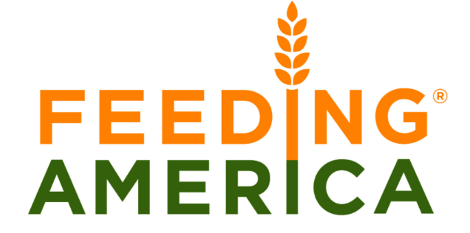
Why We Love This Logo
Feeding America is a charitable organization that seeks to provide equitable access to nutritious food across the United States.
The words are stacked on top of each other so each letter is perfectly in line, creating a simple yet effective design. Feeding America’s mission is well-reflected in the letter “I’s” which align to create an ear of wheat. The wheat illustration adds character to the logo without making the words difficult to read or distracting the viewer.
This logo also uses color to its advantage. Feeding America’s color palette strategically ties back into their mission to tackle hunger. The orange and green colors feel earthy and can easily be linked to food production.
Typeface is another feature that plays an important role in this logo’s success. Feeding America’s logo was created with the font Gotham Bold, which is a sans-serif typeface. Sans-serif feels modern, clean, and friendly, making it a great choice for Feeding America’s branding.
Top 3 Lessons From This Logo
- Integrate designs into your logo naturally.
- Be simple and intentional with your color scheme. If you’re using more than one color, make sure the colors complement each other. We recommend using 2 to 3 colors maximum to create a minimal look.
- Select a typeface and font based on the visual aesthetic you want your logo to achieve.
3. Rethink Mental Illness
Why We Love This Logo
Rethink Mental Illness aims to improve the quality of life for people with mental illness. This U.K. based organization offers support groups, mental health training, and more to improve mental healthcare.
For their 50th anniversary, Rethink Mental Illness created this special anniversary logo to commemorate their longevity. Developing an anniversary logo is a great way to demonstrate your organization’s longstanding commitment to serving its mission while adding authority to its brand. People want to feel confident that their donation is being put to good use, so highlighting your organization’s achievements can help attract more support.
Rethink Mental Illness seamlessly wraps the number 50 around its traditional logo, creating a feeling of unity. The number is large, clear, and immediately lets viewers know that this organization is celebrating a historic milestone.
Top 3 Lessons From This Logo
- When creating an anniversary logo, stay true to your original branding. Use colors and fonts that your audience is already familiar with so they can easily recognize your updated logo.
- The numbers should be as prominent as possible. We recommend making it the biggest element in your design so it’s clear that your organization is celebrating this achievement.
- Make the numbers pop with a simple yet engaging design that ties everything together.
Nonprofit eCard Design Examples
Charity eCards are a fantastic way to bolster your nonprofit’s brand identity, raise money, spread cause awareness, and foster deeper relationships with stakeholders. Let’s take a look at some of our favorite examples of nonprofits putting this type of nonprofit graphic design to use.
1. Peace Winds America
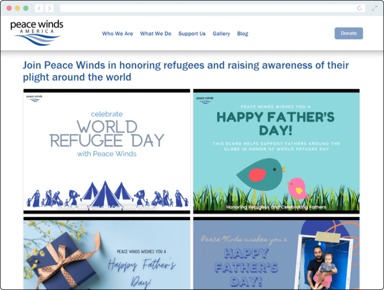
Why We Love These eCard Designs
Peace Winds is an international NGO that responds to natural disasters and man-made crises throughout the world. As part of their initiative to raise awareness of refugees’ situations, they launch a joint Father’s Day and World Refugee Day campaign.
Fundraising Letters’ donation eCards guide does a great job of explaining why this nonprofit eCard design works so well:
“For World Refugee Day, Peace Winds offered a visually-captivating eCard branded with original graphics, the organization’s logo, and its official colors. To top it all off, the typography emphasizes the purpose of the eCard and the organization behind the hard work. In exchange for a donation, supporters could send an eCard to honor refugees and raise awareness of their plight around the world.”
If you’re wanting to spread cause awareness, eCards like these are a great way to do so — especially if there’s a special cause awareness day, week, or month associated with your mission. Model your nonprofit graphic designs after these, and you’re sure to wind up with powerful greeting cards that supporters will love.
Top 3 Lessons From This eCard Campaign
- Connect your eCards to other important occasions like major holidays to make them relatable.
- Infuse your mission into your eCards by aligning the images and messages with your nonprofit, so supporters can spread cause awareness each time they send one.
- Include your logo in the corner of each eCard to make it clear that it was designed by your nonprofit.
2. Youth For Understanding
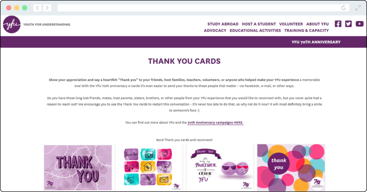
Why We Love These eCard Designs
Online cards are such a fantastic way to recognize donors, volunteers, and anyone else who makes your mission possible. Youth For Understanding (YFU) launched a thank-you eCard campaign as part of their initiative to reignite program participants’ relationships with former mentors, staff members, host families, and anyone else who made their experience memorable.
We love these designs because they incorporate the nonprofit’s colors and logo while also promoting a positive message. The organization offered an array of greeting card options, including everything from generic thank-you designs to more specific ones. Program participants could pick their favorites and send a customized, heartfelt message alongside them.
Top 3 Lessons From This eCard Campaign
- Get creative with the eCard designs you offer. A collection of different choices will give supporters multiple options from which to choose.
- Allow users to customize the messages that are sent with each eCard. This can make each eCard more heartfelt and meaningful.
- Enable different sending options, so users can send their favorite designs via email, social media, text, or some other method.
3. Point Defiance Zoo & Aquarium
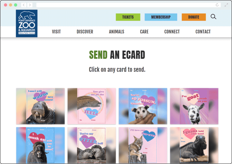
Why We Love These eCard Designs
Looking to spread the word about your mission and celebrate the holidays? Follow Point Defiance Zoo & Aquarium’s lead by designing holiday eCards.
For this campaign, they designed a huge collection of Valentine’s Day eCards that featured different animals, aligning with their mission to save wildlife and educate the public about preserving their habitats.
Users could then select their favorites to send to loved ones to celebrate the special day and encourage them to visit the zoo. Smart nonprofit marketing tactics like these can take your outreach to the next level.
Top 3 Lessons From This eCard Campaign
- While Point Defiance Zoo & Aquarium offered these eCards for free, your supporters might be willing to pay for fun designs! Consider selling eCards to your supporters, and they’ll be more than happy to, knowing the funds will go to a good cause.
- Offer plenty of designs, so your supporters can pick their favorites to celebrate special occasions. You’re not just limited to Valentine’s Day either. Create holiday eCards for every special day throughout the year, from Mother’s Day to Christmas.
- Not every card you design has to be all about your mission. Instead, you can make the main purpose of your cards be spreading joy and then include elements of your brand (in this case, animals that the zoo protects).
Nonprofit Website Design Examples: Highlighting Your Mission
1. The End Fund
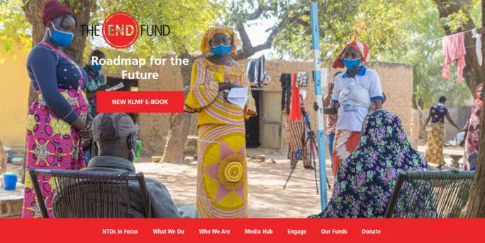
Why We Love This Website Design
The End Fund is a charitable organization that seeks to end the most common neglected tropical diseases (NTDs). This group is the only one of its kind with its critical mission to provide NTD treatments to over 1.7 billion people.
This focus on improving the lives of people affected by NTDs is evident throughout their web design. On the homepage, The End Fund breaks down their organization’s purpose with educational and engaging sections. Each section flows smoothly into the next and utilizes the same color scheme of red, blue, and black with a consistent font.
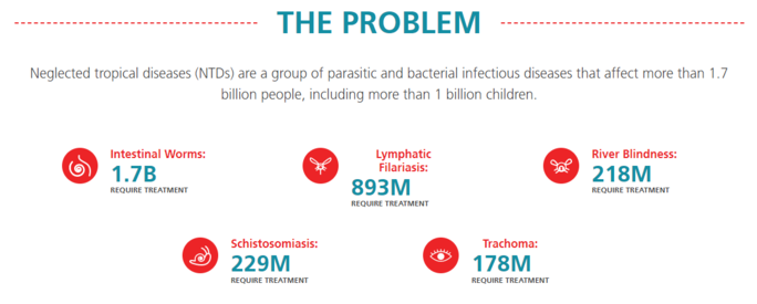
For example, “The Problem” section uses illustrations and bold lettering to highlight the number of people suffering from parasitic and bacterial infectious diseases. This design makes the statistics digestible for a wide audience. It also helps to illuminate the magnitude of the problem so people feel more passionate about The End Fund’s cause.
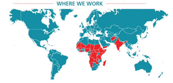
Another great feature of this homepage is the interactive map that identifies where The End Fund operates and its impact when you hover over the red countries. This visualization grabs the viewers’ attention and makes navigating The End Fund’s website a positive experience.
Top 3 Lessons From This Website
- Maintain consistent branding across your website. Use the same color palette, font, and tone of voice throughout to build brand recognition and avoid distracting users.
- Make your website well-formatted with clearly labeled headings and tabs.
- Break down complex information into easy to understand graphics. Instead of writing long paragraphs about your organization’s impact, display it in a map or infographic.
2. MAHUBE-OTWA Community Action Partnership, Inc.
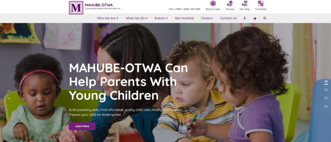
Why We Love This Website Design
MAHUBE-OTWA tackles poverty by empowering children, adults, and seniors to be self-sufficient.
Its homepage features a slideshow of engaging images that change every few seconds. These pictures include prominent captions that explain MAHUBE-OTWA’s services as well as an easy-to-click “Learn More” button that takes visitors to a more detailed page. This makes navigating the website and finding information a breeze.
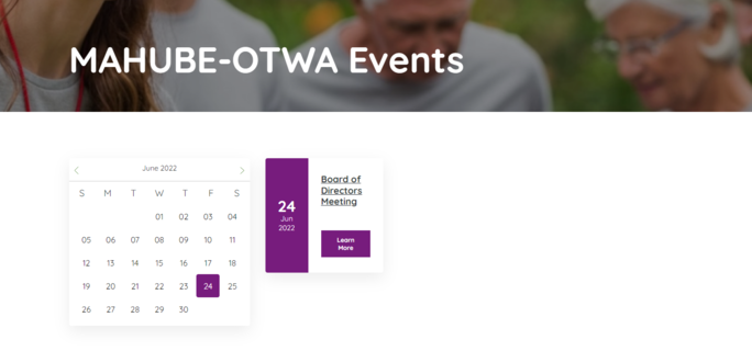
Another great feature on this website is the interactive calendar located under the Events tab, which is displayed prominently on the homepage. This calendar makes it simple for site visitors to learn about in-person or virtual events so they can get more involved. The calendar also fits well with the rest of the website because of its purple and white color scheme.
Top 3 Lessons From This Website
- Feature one or several images on your homepage. This lets visitors visualize your organization’s services and can help create an emotional response that connects people with your mision.
- Include buttons with embedded links so visitors can easily navigate to another page on your website to learn more information.
- Create an interactive calendar that makes learning about upcoming events easy. This can be coupled with text message or email reminders so your supporters can stay in-the-know.
3. Live Out Loud
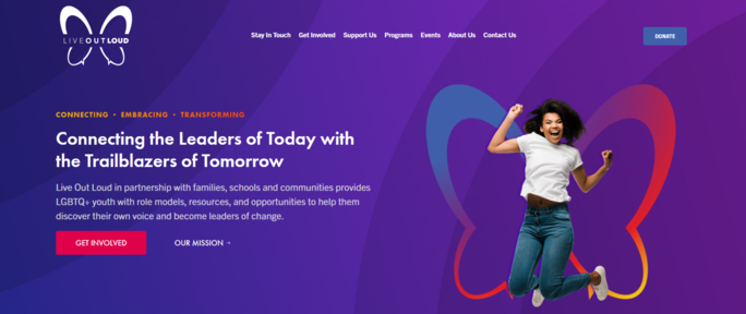
Why We Love This Website Design
Live Out Loud is a charitable organization that seeks to uplift LGBTQ+ youth through offering resources, role models, and opportunities.
The branding across the website is consistent with the butterfly logo, which is featured prominently on the homepage. Here, visitors can see a slideshow of different teens in front of the butterfly logo as if these wings are their own. This ties back into Live Out Loud’s Mission to help kids become leaders in their communities.
With a straightforward menu bar at the top of every page, users can easily find the information they’re looking for. Live Out Loud simplifies and brings attention to the online donation process through a prominent “Donate” button highlighted in blue in all caps.
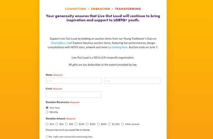
Once visitors click on the “Donate” button, a form is automatically generated with very few prompts, making donating simple and convenient. This helps donors feel more compelled to give again.
Top 3 Lessons From This Website
- Incorporate your logo into your page in a fun and unique way! This helps maintain your brand and boosts excitement over your content.
- Include a clearly labeled “Donate” button on the menu bar that grabs visitors’ attention. Try using all caps or a different font color to set it apart.
- Embed an online donation form into your website with only a few prompts. This saves donors’ time and makes the donation process simple to complete.
Nonprofit Infographic Examples: Developing Creative Resources
1. American Heart Association
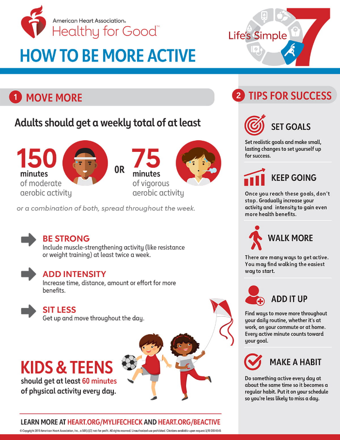
Why We Love This Infographic
The American Heart Association (AHA) seeks to promote cardiovascular health and prevent heart disease and stroke. One key way they achieve their mission is through providing public health education.
This focus on health education is evident in AHA’s infographic design. It features the clear title “How to Be More Active” in all caps at the top, which grabs the audience’s attention and defines what the infographic is about.
The layout, split between “Move More” and “Tips for Success,” is easy to understand and follow. AHA makes great use of illustrations to emphasize points and makes reading this graphic fun. The images, like the target by the “Set Goals” heading or the children playing, are relevant and help the infographic feel more approachable.
Top 3 Lessons From This Infographic
- Place your title clearly at the top and choose a short, catchy phrase that encompasses the entire infographic.
- Choose a layout that makes sense for the purpose of the infographic and is easy to follow. Your readers will be more likely to stick around and learn from the information!
- Get creative and incorporate graphics that will excite your audience and make them want to read the corresponding information.
2. World Wildlife Fund
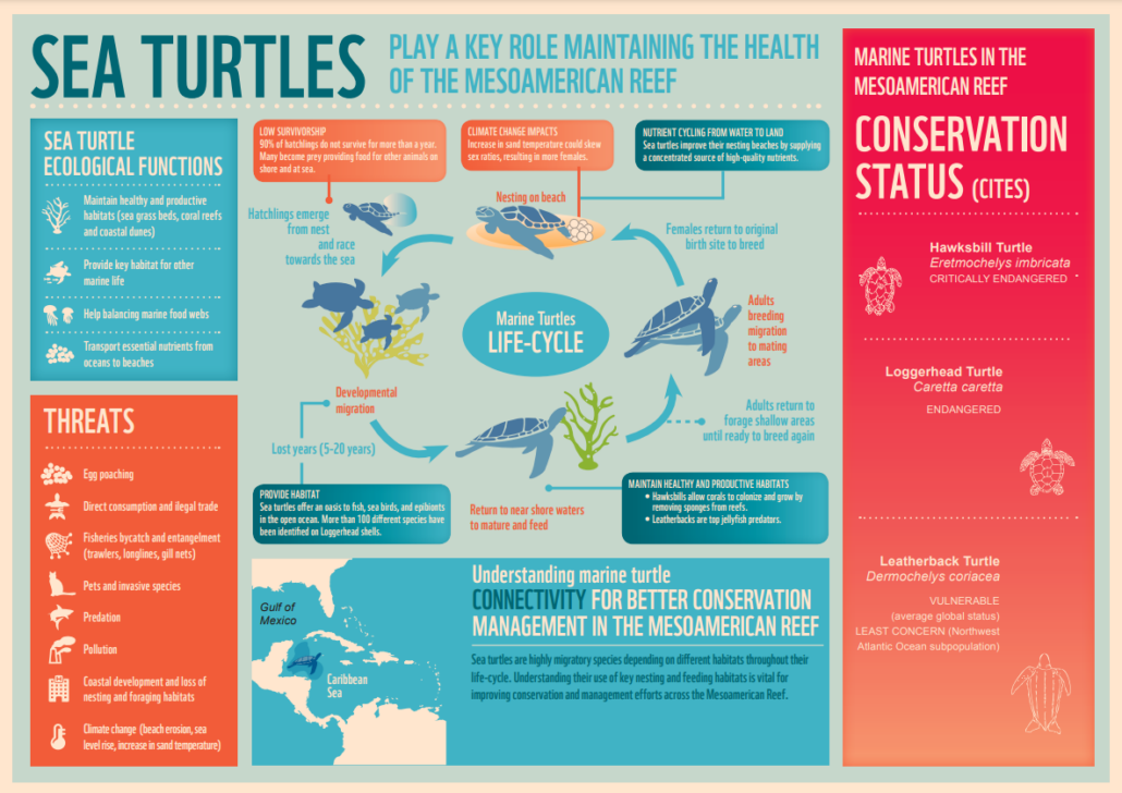
Why We Love This Infographic
The World Wildlife Fund (WWF) is a conservation organization that seeks to protect the environment and the people and animals that inhabit it.
This infographic explores the important role sea turtles play in the Mesoamerican Reef. While this could be a difficult topic to explain, WWF’s infographic makes complex information digestible through short information bullets, sections covering different subheadings, and an engaging life-cycle diagram.
The life-cycle diagram features fascinating graphics of sea turtles and brief descriptions accompanying them. Clear arrows make it easy for the reader to follow the material.
The color scheme – made up primarily of blue, orange, and pink – helps the information pop. Blue, which is the predominant color, relates closely to the ocean and adds to the visual appeal.
Top 3 Lessons From This Infographic
- Break down complex information using diagrams or brief bullet points. This helps your infographic appeal to a wide audience.
- If you’re using a diagram, make sure it’s easy to follow. Use clear symbols that your reader will understand, like arrows.
- Incorporate colors that complement each other well and, if possible, relate to the topic of the infographic. This will help your reader connect with the information.
3. Amnesty International
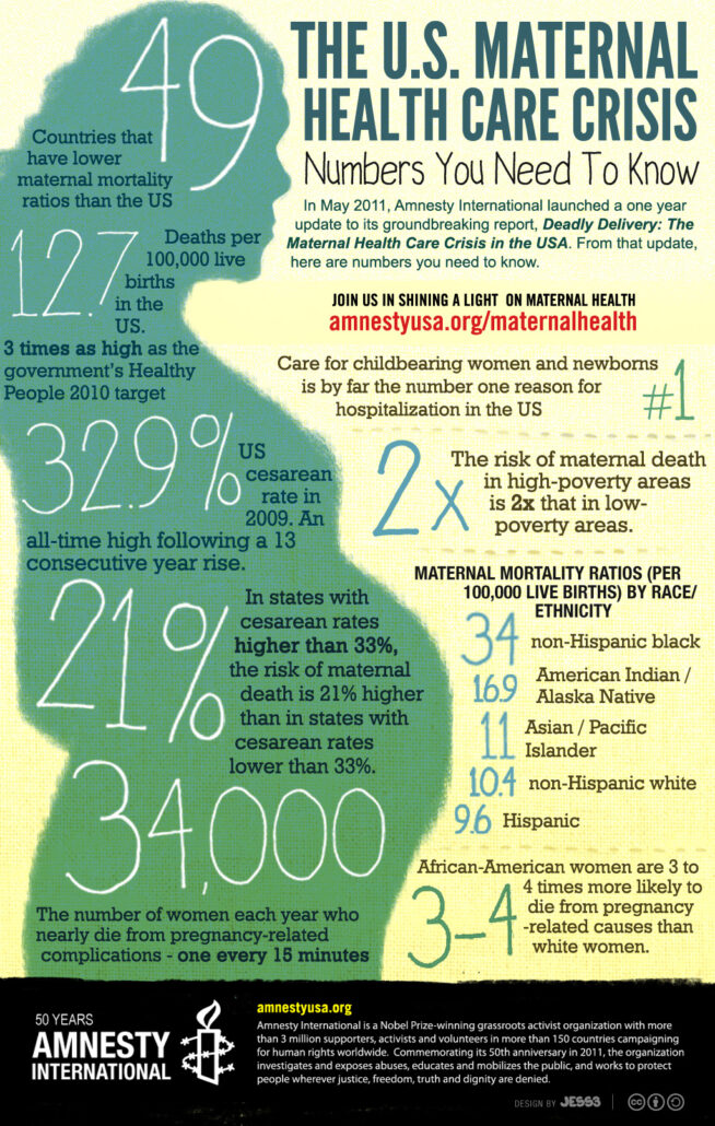
Why We Love This Infographic
Amnesty International seeks to promote universal human rights and challenge injustices around the world.
This organization strategically makes their infographic more captivating through a graphic of a pregnant woman, which is relevant to its subject. Inside of the woman, statistics are listed out in large, white text, which helps it stand out from the green color. The body font is simple and easy to read, inviting the audience to read the text associated with the numbers.
Amnesty International has clear branding at the bottom of the infographic. This helps to build brand visibility and let viewers know more about the organization so they can get involved.
Top 3 Lessons From This Infographic
- Make important statistics stand out by varying the text color and size. This will help bring your audience’s attention to the highlights of your infographic.
- Choose a body font that complements your title and header fonts and has a minimal feel. Your reader will feel more inclined to read over everything as long as it doesn’t feel too overwhelming.
- Include your organization’s name to increase brand awareness and, if space permitting, add the logo, purpose statement, and link to your website/social media handles.
Nonprofit Brochure Examples: Telling Your Organization’s Story
1. Doctors Without Borders
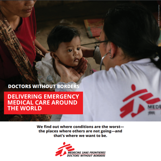
Doctors Without Borders is a humanitarian organization that provides medical care for people in conflict.
This digital brochure – 7 pages in length – gives a comprehensive overview of the organization including how they carry out their mission and use donor funds. On the front page, viewers can clearly see the organization’s name printed in the center and at the bottom as part of their logo.
The first page also includes a large, clear image of the organization at work, showing a child receiving medical treatment from a volunteer. This image highlights the impact of Doctors Without Borders and creates an emotional response.
The branding is consistent throughout the brochure, which uses the red, black, and white color scheme and the same header and body font. This strategy boosts brand recognition and maintains readers’ attention.
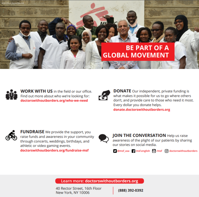
Another great feature of this brochure is the strong call to action at the end. Doctors Without Borders encourages readers to “be part of a global movement” and offers multiple ways (with links!) that they can get involved.
Top 3 Lessons From This Brochure
- Use images to drive emotional impact! Include a powerful image on the front page that will make someone want to open up your brochure and read its contents.
- Maintain consistent branding throughout the brochure. Your font, color scheme, and tone of voice should align with your other communication channels and advertising materials.
- At the end of your brochure, include a call to action and let your supporters know what steps they can take next to get involved.
2. Atlanta Humane Society
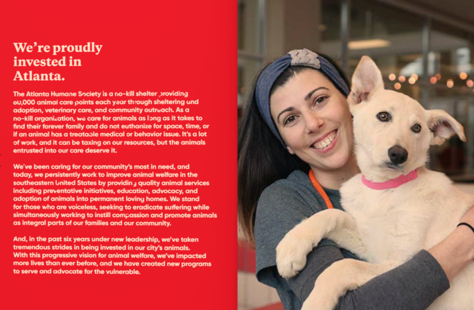
The Atlanta Humane Society (AHS) is a charitable organization that provides shelter and veterinary care for homeless animals.
Their digital brochure can be flipped through like a book, enhancing the reading experience and inviting readers to engage with the material. AHS has a section dedicated to explaining the organization’s animal-driven mission and its impact in the Atlanta community. This helps supporters feel confident that they are giving back to a worthy cause. Plus, it can help boost local support because of the organization’s proud ties to Georgia’s capital city.
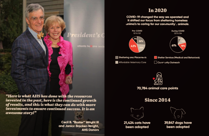
Another highlight is the use of graphics to represent how AHS has used donations to power change. The pie charts illuminate how AHS shifted from focusing primarily on shelter services to community outreach with COVID-19. These visualizations (and fun illustrations of pets!) help readers better connect with the material.
Top 3 Lessons From This Brochure
- Let your reader know all about your organization! Within the first few pages of your brochure, there should be an about section that dives deep into your mission.
- Appeal to your audience! If you’re a smaller nonprofit organization, you’ll want to draw supporters from your area. A great way to do this is by showing your pride for the city or region.
- Include charts or graphs so your statistics resonate with readers. Include a clear key that explains the color scheme.
3. Boys and Girls Club of York County
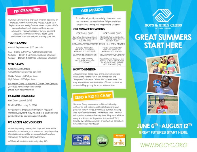
The Boys and Girls Club of York County focuses their mission on empowering children to realize their full potential. This is done through a variety of programs for children, including summer camp.
This brochure works well for in-print distribution because of its tri-fold layout. Rather than focusing on the organization as a whole, this example targets the summer camp experience to get more children to enroll (and spread their mission far and wide to increase donations)! This allows the organization to provide more focused details such as the summer locations and fees.
The front panel establishes a clear purpose so people know that this brochure is all about summer camp. Colorful photos of kids having fun appeals to parents and will increase the chances of families reading through the brochure to learn more.
Another great quality is the clear headers, distinguished by bold font and colors, to bring the reader’s attention to the different sections. Even though the brochure has three different panels, there is a consistent style with the blue and green background colors and white text boxes.
Top 3 Lessons From This Brochure
- In-print brochures are a great way to expand your outreach to people that may not be familiar with your organization. Choose a simple layout, like the tri-fold design, so your brochure feels more inviting to read.
- You can use brochures to focus on specific programs or events. Dive deeper into the details, but include a small section that explains your organization’s mission.
- Grab your reader’s attention! Your in-print brochure should stand out even when it’s placed with 10 other brochures. Opt for bold colors and exciting graphics on the front panel to intrigue people to flip through!
Nonprofit Video Examples: Expanding Your Reach
1. Smile Train
Why We Love This Video
Smile Train is a charitable organization that treats children with cleft lips and palates.
This organization has designed their video to be both informative and emotional. The video begins with a lighthearted animated scene of a child throwing food around and giggling. This is coupled with an important statistic about how children eat several meals a day. However, the next part of the video tugs at the viewers’ heartstrings by explaining that this is a struggle for children with clefts.
This video evokes an emotional response in the viewer and makes the audience feel more connected to their cause. Its simplicity draws attention to the problem Smile Train is trying to solve and why it’s an important issue to address.
The video is only 17 seconds long, but it gets to the point quickly and effectively. Viewers immediately know why Smile Train exists and their interest is piqued to learn more.
Top 3 Lessons From This Video
- Make your graphics interesting and relevant to your organization’s mission. Animation, for example, can be a great tool for organizations serving children.
- Statistics can be powerful in highlighting an issue, but don’t go overboard with it. Just one statistic can help shed light on your organization’s mission without overwhelming your audience.
- You don’t have to produce a lengthy video to make an impact on your viewers! A video that’s short and simple keeps the audience’s attention and is a great way to introduce people to your organization.
2. American Cancer Society
Why We Love This Video
The American Cancer Society (ACS) seeks to end cancer through groundbreaking research, public education, and policy changes.
This video shows real people affected by cancer and how ACS positively impacted their lives. Ranging from children to adults, the people in this video demonstrate the scope of this problem and how it can impact anyone at any time. Their stories are raw and vulnerable, with one woman even saying that she has a high chance of getting cancer again in the near future.
Between clips of survivors, the video includes slides with short phrases to drive important points home, like “You can make a difference,” and “We need your help” in all caps.
Along with cancer survivors, the Chief Medical Officer of the ACS is featured in the video. The video ends with his powerful appeal to the audience for donations to save lives like the people shown in the video.
Top 3 Lessons From This Video
- Featuring people and stories of impact can help build connection to your mission. People want to feel confident that their donation is going towards a good cause, so this lets your audience know how their money is making a difference.
- Add text to your video to emphasize important points, but keep it short and sweet! You don’t want to overwhelm your audience with too much text. Stick to visuals as much as possible.
- Have a strong call to action in your video. Ask supporters to visit your website to learn more or donate.
3. Education and Employers
Why We Love This Video
Education and Employers aims to inspire students by connecting them with volunteers working in a variety of different professions.
This video follows a real-life case study of students to track gender stereotypes in the workforce – but there’s a twist! Three women ask the students to draw a surgeon, fighter pilot, and a firefighter, and the video follows the children’s drawing process. The majority of the children opt to draw a man for each of the professions, and are surprised when the women reveal that they work in these professions.
The twist in the video is a surprise to both the children and the audience. Education and Employers accurately captures the problem of gender stereotypes in this video and why there is a need to help children, especially young girls, realize their potential.
This video also interlays statistics about gender stereotypes and other key points with the clips of the classroom experiment. Black text on the white screen, as well as the letters formatted in all caps, grabs viewers’ attention. The typeface is easy to read and minimal, which increases the chances of the audience reading and internalizing the message.
Top 3 Lessons From This Video
- Share your mission in action! Showing the audience a real-life situation of your organization’s impact and the issue it’s trying to solve can help increase your number of supporters.
- Incorporating shock value can capture people’s attention and boost interest in your cause.
- If you’re including text, make sure to use an easy-to-read font. Make your text stand out by using bold print, all caps, or a color that pops.
Wrapping Up
Now that you’ve seen the best nonprofit graphic designs, you can dive into bringing your own logos, websites, infographics, brochures, and videos to life!
Including some (or all) of these graphic design types will help get the word out about your awesome nonprofit (meaning more supporters and more donations)! Consider which types of graphic design would be most effective to bring attention to your mission and programs.
And remember, you can always keep learning! Continue to gather inspiration from nonprofits doing great things with graphic design. Check out their social media and websites so you can create the most engaging designs possible!
Interested to learn more about nonprofit graphic design? Explore these additional resources:
- Essential Guide for Choosing a Graphic Design Company You don’t have to be an artist to jumpstart your graphic design! Share your ideas with a graphic design company and let them take care of the heavy lifting.
- The Meaning of Color in Logo Design Your brand’s color scheme directly affects the way audiences will perceive your organization. Learn all about the emotional effects of different colors and how to decide which one is best for your nonprofit!
- Choosing the Best Social Media Platform for Your Business Once you’ve got great graphic designs, you need a surefire way to get people to see them! Check out the different social media platforms you can use!


