
Nonprofit Web Design — Nonprofit Catalog
Your nonprofit website is one of your organization’s most valuable marketing assets. It’s supporters’ online hub and go-to resource for everything related to your organization. Whether you have an in-house graphic designer or outsource the work, you should take the time to learn the basics of nonprofit web design and ensure your site is the absolute best it can be!
What Is Nonprofit Web Design?
Nonprofit web design is the practice of conceptualizing and arranging content on a website to create a positive user experience. While web developers usually focus on coding and coordinating the technical elements on the “back-end” of websites, web designers focus on the visual elements that users see and interact with.
Specifically, web design encompasses steps like choosing layouts, images, color schemes, fonts, and other “front-end” elements. Optimizing your design and user experience requires you to balance aesthetics with functionality.
How Effective Nonprofit Web Design Can Help Your Cause
As your nonprofit’s primary digital asset, your website can (and should!) communicate your mission and establish a sense of respectability among users. A strong nonprofit web design tells your supporters that your organization is modern, professional, and reliable. In turn, establishing a sense of trust through your site will reinforce their confidence in contributing.
Plus, an effective design will help users navigate through your web pages, find the exact content they need, and tell them how to get involved quicker than with an outdated design.
Ultimately, a functional, user-friendly, and visually appealing nonprofit web design will make a strong first impression on new prospects and foster relationships with current supporters.
Tips for Designing Your Nonprofit Website
There’s no single “right” way that your nonprofit website should look. Rather, each organization’s website will look different in order to convey its cause and represent its brand. However, there are a few basic principles that will result in a cohesive nonprofit web design for any organization.
1. Create a consistent, branded user experience.
The last thing you want is for someone to be several minutes into browsing your site, decide to get involved by volunteering, and click through to your signup page only to be met with a webpage that looks entirely different from the rest of your site. This interrupts the user experience, makes them think they’ve wound up on an entirely different site, and can make them wary to continue browsing.
Instead, ensure every page on your site is fully branded to your cause and offers a consistent experience by featuring:
- Your organization’s logo in the header
- A color scheme that prioritizes your official colors and complementary ones
- Images that showcase your beneficiaries, supporters, and cause altogether
- A maximum of 3 different legible fonts
Creating a consistent visual experience will ultimately keep users on your site as they stay fully emerged in your content!
2. Strategically place your calls to action.
Your calls to action (CTAs) tell readers exactly how to get involved in your cause. Whether they find your site through a Google Ad, organically on a search engine, or from your social media, you want readers to know what they can do to support your work. Most often, this means asking them to donate, volunteer, register for an event, or sign up for your newsletter.
Consider where you place your CTAs. For example, most nonprofits feature a ‘Donate’ button in their header so that it appears across the entire site. You can also include them on your homepage, informational pages like your ‘About Us’ page, and blog posts.
The most effective CTAs include:
- Clear, concise, and urgent language such as ‘Volunteer now!’
- Bold text and eye-catching colors
- Links to relevant landing pages, such as a volunteer registration or donation page
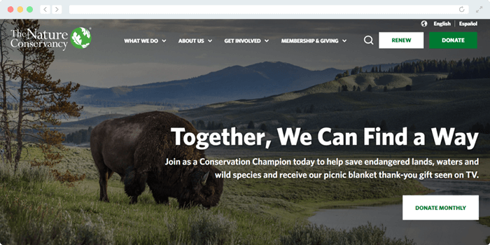
Take The Nature Conservancy’s website for example. They feature three well-placed, clearly-worded CTAs on their homepage, encouraging users to take meaningful actions:
While CTAs are a must-have element for effective nonprofit web design, note that too many CTAs will clutter your page. Think critically about the most meaningful next action you want supporters to take when exploring different content on your site!
3. Include captivating imagery.
Illustrations, still photographs, videos, and other graphics are vital for creating a visually-engaging nonprofit web design. When choosing your imagery, keep these strategies in mind for a more cohesive look:
- Feature your own photographs. Stock images can work well, but including photos of real volunteers, donors, and beneficiaries will make your site much more engaging and authentic.
- Convey your brand. Any images you include on your site should be expressive and communicate your nonprofit’s story. Illustrations and purely decorative graphics should feature your brand colors, while photographs and videos should showcase those who support and benefit from your work.
- Choose only a few images. There is such a thing as too much of a good thing. Avoid overcrowding your site with excessive images. Otherwise, you’ll risk a cluttered design that distracts users. Plus, too many images can slow your site speed down.
Choosing your images strategically can boost site engagement, drive more traffic, and ultimately boost your conversions. After all, humans naturally process images much quicker than text. Kwala’s fundraising flyers design guide mentions that:
The human brain can process visuals 60,000 times faster than text. And when paired with text, visuals can also increase people’s retention of information, making it crucial part of nonprofit web design.
4. Feature a responsive design.
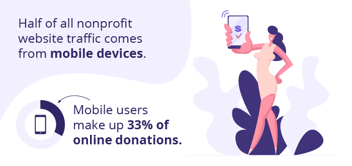
360MatchPro by Double the Donation’s fundraising research estimates that half of all nonprofit website traffic comes from mobile devices. What’s more, mobile users make up an incredible 33% of online donation transactions. Knowing this, you should ensure your site works seamlessly on mobile devices.
A responsive nonprofit web design will automatically reformat your content to fit any screen size, opening up your cause to more people.
You can take your mobile-first design a step further by compressing images to quicken your load speed, minimizing the number of pop-ups you include, keep layouts vertical, and use larger fonts.
Additional Resources
Nonprofit Catalog – Read up on more nonprofit essentials by exploring our Nonprofit Catalog.
6 Types of Nonprofit Web Design and When to Use Them – Explore the different types of layouts and other tips to incorporate into your nonprofit web design.
Graphic Design for Nonprofits: What To Know & 9 Free Tools – Dive into the world of graphic design and find tools to kickstart your nonprofit web design journey with this guide from Kwala!


